In animation, appeal does not mean a character is pretty, friendly, or marketable. It means the design is clear enough that the audience instantly understands what they are looking at. A grotesque monster, a grumpy villain, or a shapeless blob can all have strong appeal if their proportions, silhouette, and construction communicate intent without confusion.
This distinction matters because beginners often assume that adding detail, realism, or complexity will make their characters more professional. The opposite is usually true. Complexity obscures. Simplicity reveals.
Appeal as Clarity of Shape
Professional character designers think in simple geometric forms before adding any detail. Circles suggest softness or innocence. Triangles suggest tension or danger. Rectangles suggest stability or rigidity. These shapes must be readable at a glance, even when the character is in motion, partially obscured, or viewed from an unusual angle.
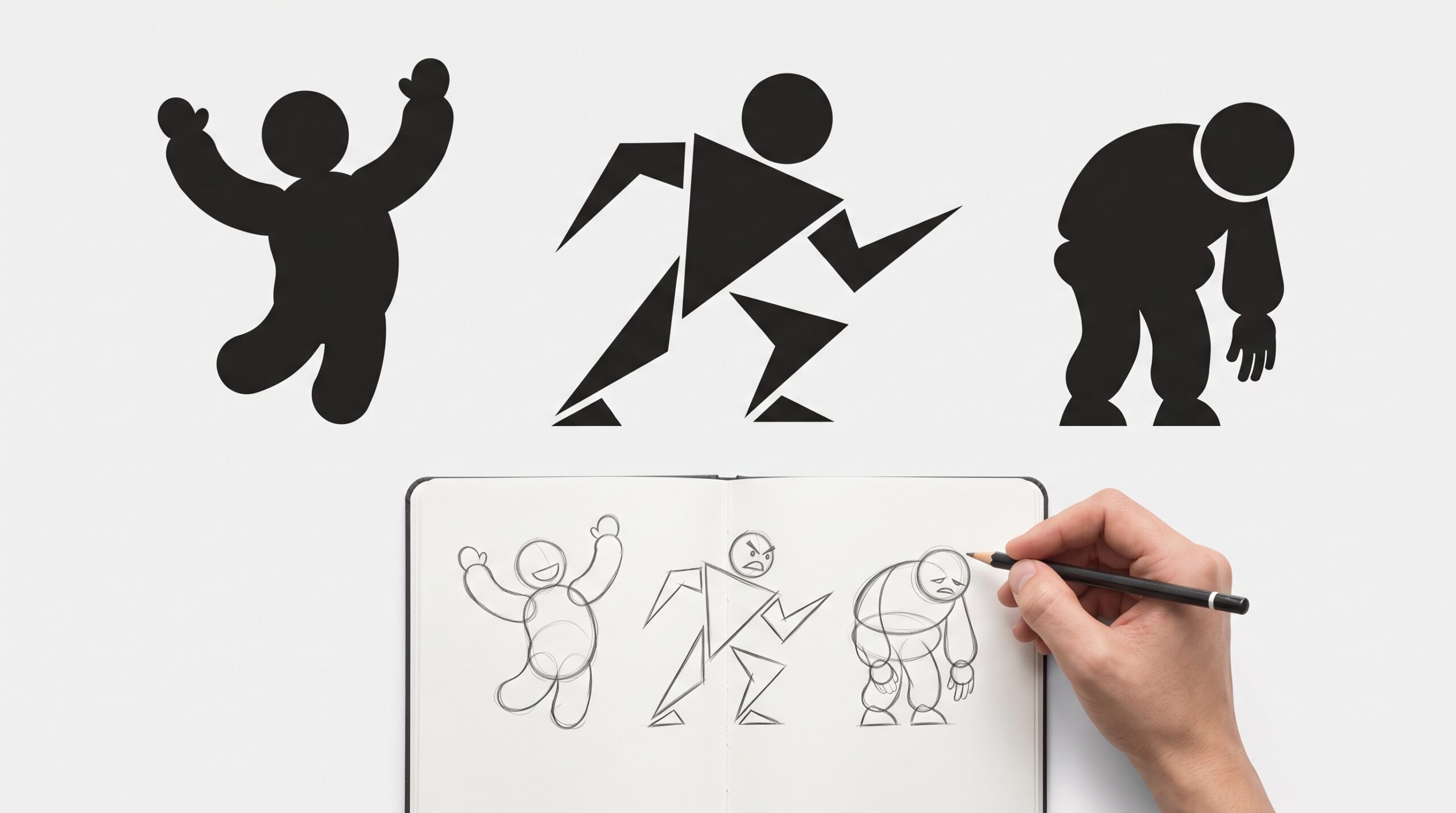
A character with strong appeal will be identifiable from its silhouette alone. If you fill the frame with solid black and can still tell what the character is doing and feeling, the design has appeal. If the silhouette becomes a confusing blob of competing lines, the design needs simplification.
Examples of Strong Appeal
Mickey Mouse remains one of the most readable characters in animation history. His construction is built from three primary circles: one for the head and two for the ears. This simplicity allows him to be drawn from any angle, express any emotion, and remain recognizable at any size. The appeal comes from geometric clarity, not detail.
Baymax from Big Hero 6 demonstrates that appeal can exist in extreme minimalism. The character is essentially an inflated oval with two dot eyes and a line mouth. There are no wrinkles, no complex costume elements, and no facial features beyond the basics. Yet the proportions and soft round shapes make the character instantly sympathetic. Any additional detail would have weakened the effect.
The Genie from Disney’s Aladdin shows that exaggerated, chaotic design can still have strong appeal. The Genie’s body stretches, morphs, and defies physics throughout the film. However, the underlying construction always maintains a clear line of action and readable silhouette. Even when transforming into a helicopter or a pinstripe suit, the audience never loses track of where the head, torso, and limbs are. The exaggeration is controlled because the foundation is simple.
Wall-E communicates an entire emotional range through two binocular eyes and a boxy body. His appeal comes from the contrast between his rigid mechanical shape and the soft, organic movement of his eyes and hands. The design is intentionally limited, which forces the animators to sell the performance through posture and timing rather than facial detail.
When Complexity Undermines Appeal
The 2019 live action Sonic the Hedgehog initial design provides a clear lesson in how realism can destroy appeal. The original trailer revealed a Sonic with human-like teeth, visible fur texture, separate eyes instead of the classic connected eye shape, and anatomically detailed limbs. These additions made the character fall into an uncanny valley. The silhouette was cluttered. The recognizable shape that made Sonic iconic was lost under layers of unnecessary detail. The subsequent redesign returned to simpler, more graphic proportions, restoring the character’s readability and appeal.
Live action Transformers designs illustrate another common trap. The robot forms contain hundreds of interlocking parts, exposed gears, and fragmented surfaces. In still images, these designs can look impressive. In motion, they often become difficult to read. The eye cannot find a focal point because every surface competes for attention. The silhouette becomes noisy. Animation appeal requires the audience to process a character in a fraction of a second. Overly complex designs fail that test.
Early attempts at fully realistic human characters in CGI, such as some mid-2000s feature film experiments, suffered from similar problems. Skin pores, individual hair strands, and precise anatomy were rendered with technical accuracy, but the performances felt cold or unsettling. The appeal was lost because the designs prioritized replication over clarity of intent.
The Silhouette Test
Before committing to a final character design, professional animators perform a simple check. They convert the character drawing into a solid black shape against a white background. If the action, emotion, and posture are still readable, the design has appeal. If the silhouette becomes ambiguous or requires internal lines to explain what is happening, the design needs simplification.
This test works for heroes, villains, props, and creatures. A scary monster should have a scary silhouette. A tired character should have a tired silhouette. The shape itself should do the storytelling.
Exercise: The Shape Test (10 minutes)
Draw three characters on a single page. Use only circles, rectangles, and triangles. No facial features. No clothing details. No lines inside the shapes.
Character one is happy. Character two is angry. Character three is exhausted.
Achieve this using only body shape and posture. A happy character might use upward-facing triangles and an open, lifted circle for a torso. An angry character might use sharp, forward-leaning triangles and a compressed stance. An exhausted character might use drooping circles and a collapsed rectangle for the shoulders.
Show the drawings to someone who has not seen the instructions. Ask them to identify each emotion. If they can do so reliably, the shapes have appeal. If they are unsure, adjust the proportions until the intent is unmistakable.
This exercise proves that detail is optional. Clarity is mandatory.
Start learning the principles of character design and animation. Classes start September 29th.